MyHEAT
201-1228 Kensington Rd NW
Calgary, AB T2N 3P7
Canada


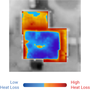
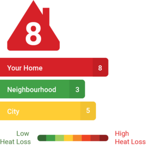
Heat Loss Comparison Group
This group received a personalized HEAT Map of their home, and a HEAT Rating comparing their home to their neighbours' and the city average on their utility bills.
Home Energy Report (HER) Group
This group received a graphical comparison of energy usage to similar sized-homes on their utility bills
Control Group
This group received no treatment-specific messaging on utility bills.